 I signed up for the pre-order of the Leap Motion controller ages ago. And, of course, it must arrive whilst I was on vacation… But, hey, it’s here now and since I was asked by a couple of friends to provide them with my thoughts, this is my first ever product review. A few words of caution though: I am not providing a fully-fledged review, just a few bits and bobs and my thoughts on the overall thing. For more traditional things, see e.g. here or here (consumer-focussed simple overview) or here (more in-depth technical).
Installation Environment
I installed it on my MacBook Pro (13” Retina, 3 GHz i7, 8GB RAM, 512GB SSD) running on the latest OS (at the time of writing, that’s 10.8.4). It comes with two cables, a long and a short one, which is a neat idea. Alas, I would actually have wanted a cordless one but the, I guess, it might be a wee bit early for some BlueTooth 4.0 magic, so I’ll let this pass. It does not come with a manual and whilst that is oh-so-valley-style, a “cheat sheet” for the various gestures might be a good idea: as it is such a completely novel interaction method, it would make peoples’ lives a lot easier if they could check back quickly in the old-fashioned style. I mean, you could do it hipster-infographic-style as a hat-tip to the Valley, could you not?
You plug in, are asked to go to a website and install the software. Simple.
The Start
The first thing you do is go through an “orientation” programme, which is sheer beauty and gives you the first, well, orientation on what to do (and what not). This is the first bit where it shows you what it sees (in rough but pretty terms):

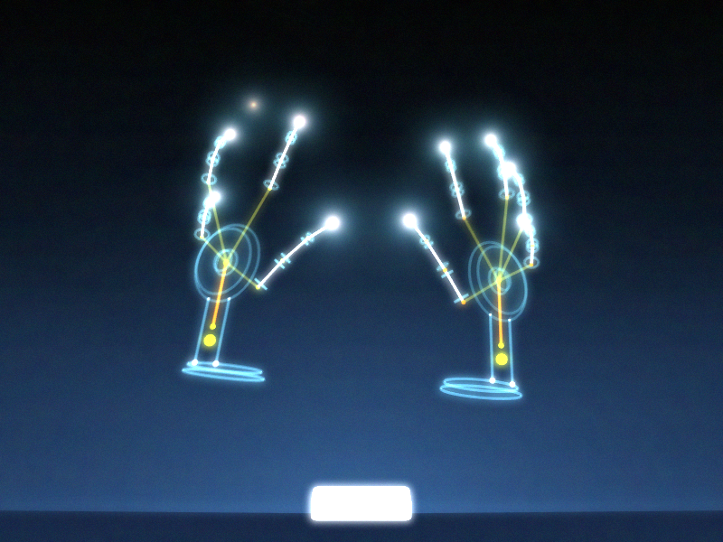
Then it shows you what it really sees (in more accurate and mechanical terms):
The rest is play. Here’s my son practicing his signature:

Using Leap Motion…
Then I started off. There are quite a few pretty cool apps available already (the company announced 1m downloads today, a mere 4 weeks after starting to ship to consumers). The New York Times app is nice (if practical). There are some sweet ones exploring molecules, etc. There are, alas, also some that don’t really work (yet). The usual shenanigans every new platform goes through. Anyway, I then downloaded the “Touchless for Mac” app, which turns the Leap controller into a navigation tool for your computer. And it works: It took me the best part of 20 minutes to actually get going nicely. I could open web pages, scroll through my Facebook feed, open links, play (and pause) video, etc. without too much struggle or stress. Latency is basically absent.
Mind you, this is not Minority Report if you are in the early stages of use (there is a “basic” and an “advanced” setting; I haven’t ventured beyond “basic” yet). But what would you expect? It is new, you have never used gesture controls in space (unless you’re Tom Cruise of course), so you will have to learn. I have little times for nay-sayers that already point out that it’ll fail because it is not perfect. It is a very impressive start!
My son (18, slightly geeky [and designy] aspiring Physicist and skateboard apparel entrepreneur) was, unsurprisingly, a lot faster than I in picking this up. It took him the best part of 5 minutes to successfully navigate around the parts that caused me some trial and error (small buttons, e.g. the “close window” one). BTW: Even my wife thinks is cool, and she hasn’t even seen Minority Report!
Apps, Apps, Apps…
In the year of the Lord (if you are so inclined) 2013, we all know that any device is only ever as useful as the applications that exist for it. And this is where the whole Leap experience delights and, erm, shows potential for growth at the same time: there are some apps out there already (and bear in mind that it’s a mere 4-5 weeks they are in the market only) that show you what can be done with this. And I would say it shows great promise! There are, however, also some absolute dogs (I won’t name and shame as I have no inclination of rubbishing brave developers that took an early leap [sic!] of faith to get behind a new platform).
User Interface
The biggest challenge is the bridge between today’s computer interfaces (I have yet to play around with it on Windows 8; need to “borrow” my daughter’s computer for that) are either mouse- or touch-centric. This is to say that they do not take into account the intrinsic constraints of gesture-based UX systems. That is to say: there is a natural constraint in how the Leap Motion can work with today’s computer systems. That, however, is (arguably) not the Leap Motion’s fault. The promises are huge as it removes artificial middlemen between the content and the user’s natural input mechanism (of which gesture is one). However, the full power of it will only come to fruition if paired with an OS interface that is designed for it, and this might – at least in the short term – be the snag: Leap doesn’t have that.
They have done a lot of things right though (the developer uptake is testament to that for a start) and it would be thrilling to see it being married to an interface that is actually built for it. It is not that hard, I think: Leap Motion’s own store shows (in a webpage) how to adapt a few things that make it very usable indeed.
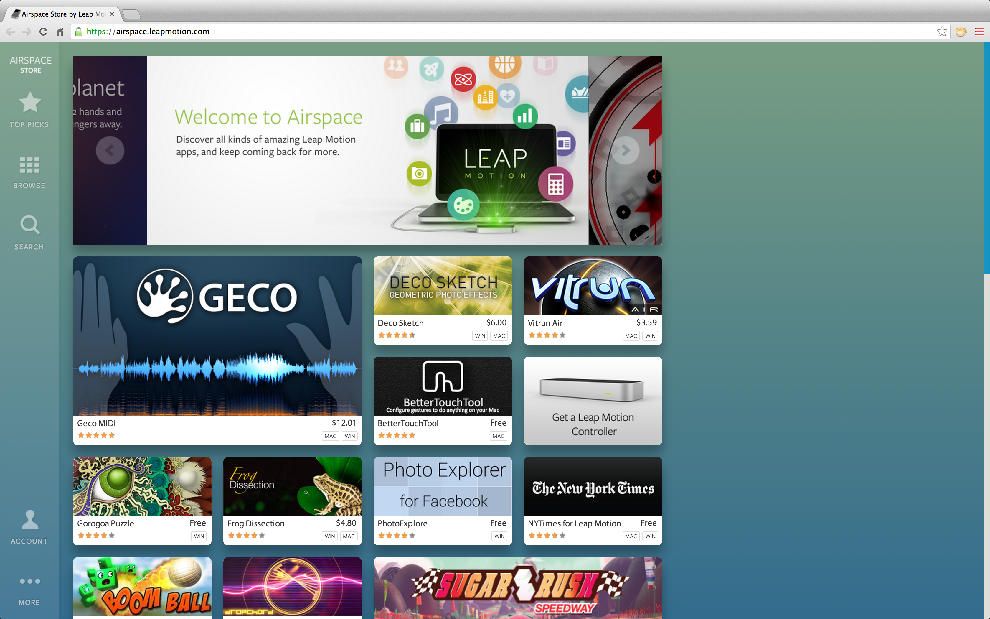
Big buttons, clear borders between items, etc. make it a whole lot easier to navigate fluently and quickly using the gesture input. This is running in a present-day browser, so can’t be rocket science. There are already some convincing implementations of the Leap’s controls into live services: Google Earth as well as Nokia’s Here Maps already allow you to use the Leap Motion controller as an input device and that works really well!
One downside is the “jump” if you scroll: it sometimes just drops when you move your finger forward (a “click”), essentially misinterpreting what you want to do. This then can open another app (because it got “hooked” in the app tray below) or do some other stuff you didn’t really want it to do. Because of the above-mentioned challenge with small “close window” buttons, this is not a welcome distraction.
Another challenging piece is to use the Leap Motion in concert with keyboard and touchpad: because your fingers move in and/or near the “vision” of the controller, it sometimes interferes by e.g. re-setting your pointer to somewhere else on the screen, which is somewhat annoying. For everyday use, this is even fatal: if you always have to activate/de-activate and/or connect/dis-connect, you will probably not be using it at all once the early excitement has worn off. But let this not deter you from the concept: this last challenge could very easily be abolished would OEM incorporate the controller into an actual computer: the moment you use the keyboard, the Leap controller would simply be “muted” (or something a whole lot smarter than that). None of the constraints are flaws of the technology but merely on how it interacts with today’s commercially available hardware. If you allow a crude comparison: a Lamborghini Aventador would not have been much fun on cart tracks in the 19th century: the device would simply not interact that well with its incumbent environment. Alas, we are not 150 years apart here: all components exist and could work hand in glove (I know, tacky pun) with each other with only very few tweaks.
And Onwards!
And this is where it gets exciting: imagine a controller like this for navigation tasks, voice, etc for things like text input and couple this with anything from Google Glass to Pico Projectors (fairly sure Wikipedia needs an update here) to proximity-aware screens in your environment (you walk into your home, it all comes alive on a 50” screen whereas it would happily play on your Google Glass-type screen whilst you are on your way from work in the metro/tube/bus/subway). You have the freedom to choose and use natural inputs (voice, gestures) depending on what makes most sense for the task at hand. Doable? Absolutely. Close? I suspect so!
Conclusion?
So what do I think? After the above, you’d appreciate this is only an interim conclusion. In principle: I love it! How often will I use it in the next six months or so? Not very much, I guess, as it still doesn’t have the critical bits I particularly need (I am one of the boring MS Office/Keynote/Chrome types). But what can it (and/or competitors, successors, subsequent evolutions of it) do? Enormous things!

 Sluggishly reacting applications, latency in almost everything you do, crashes, blank screens, long lag to pick up networks, buggy settings. Do you remember any of this? Sounds like some old-fashioned feature phone that was somewhat overloaded by its ambitious maker, doesn’t it? But, alas, no, it is not. This is the user experience with a one-year-old iPhone 3G, 16GB since 24 June 2010. Do you recognise the date? Then luck will have it that you have experienced the same: the grandly titled “iOS4” update that was being pushed down your throat (or rather iTunes) to your iPhone 3G.
 And then it came back to bite them! I am not a techie but iOS4 on the iPhone 3G feels like someone put a little too much luggage onto too frail a porter: the things creaks and aches at every corner. Gone are the days where one could switch from one app to another in seconds, where the iPhone – in good Apple style – did what you wanted it to do without much ado but breathtaking efficiency and speed. Now, it is clunky and, well, very old-fashioned. It could of course all have been avoided: just don’t push iOS4 to the iPhone 3G (or older models). No one would have cried, you should think: if the hardware cannot handle it, it cannot handle it. Users understand such things one should think. Keep iOS4 to the iPhone 4 (even the numbers match, doh!).
 However, I think that is not it. My suspicion is rather more frightening. It very much feels like Apple starting to overextend itself and learn how complex and fragile it is to deal in the mobile space. Pushing iOS4 to devices that obviously (not only under some special and hard to find circumstances) cannot cope with it is just shoddy. Every game or app developer in the market for more than 2 years would have caught this in QA. Does Apple not have QA? Or not anymore? Or at least not enough? It might happen to you when you try too much too quickly. Apple’s passion (or paranoia?) that drives it to try and do everything itself appears to haunt it now: I mean, QA is really simple. You don’t need cohorts of phDs in elementary physics to do this. It doesn’t take you 3 years to build it up. And – last but not least – Apple appeared to being very much on top of this in the past. So what happened?