
Today is a day where I have to sing our own praise a little. Today, as some of you will know, Apple released iOS 7 into the wild. I will spare you a wider critique (I reckon there will be plenty of them out there). But one thing caught my eye. Given my historical interest in social gaming platforms (after all, Scoreloop did a lot of the things – and better – that Apple tried to mimic with Game Center), I went to have a look how they re-designed it (Jony Ive’s hues and all). Now, not only is the dreaded felt gone (phew!) but also did they adopt a playful bubble design. Fits the image and all, right?
Now, it did look somewhat familiar though. And then it struck me: it is very similar to the design approach our very own Blue Beck took when we (well, our teams as I didn’t do much) designed the app for Three, the UK network operator. Compare for yourself (left our Three app, right Apple Game Center):
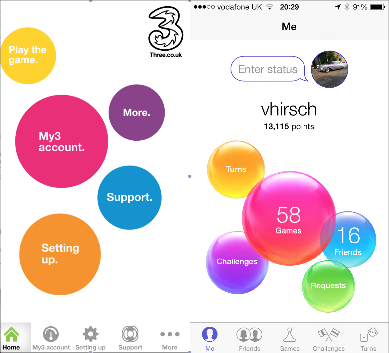
I actually think, we did the colour scheme a lot nicer! I am still not a fan of Jony’s hues, I’m afraid (though I like the more “contemporary” feel of the new iOS generally…). You can, incidentally, download it here:
And so, tonight I would like to sing the praise of our wonderful team at Blue Beck and our esteemed client Three (on whose style guide we based the design) and will sit with a smug face and think that Apple “borrowed” (which they probably didn’t, but hey) from our own design prowess. Carleton, Dose, Rick, Pete, you rock (and, of course we always knew that), and tonight is the night to call it out! (and, to the rest of the Blue Beck team: so do you – just don’t get the hang of them hues, OK?).
Hail the kings of Blue Beck castle! 😉 (and if you haven’t realised: full disclaimer: I am a shareholder and director of Blue Beck).